Monday, 19 July 2010

Script writing, pitching and random stuff

Random Stuff:

The title of my blog says: "Alexandre Lieme - Animation works", except that i haven't upload any animation since Valentine's day! It doesn't mean I haven't been working on any though, just nothing worth uploading really.

The 3D assessments for last semesters consisted in: a walk cycle; an action shot(I chose pushing) and a short TV commercial. The only one which could be interesting would be the last one. It's 15sec long, the main character is a Energy Drink Can with arms and legs. A simple story line: The Can is about to get squashed by a giant "F", it gets a energy drink from who knows where and drinks it(cannibal!!!). Then it powers up Super Saiyan style, lifts the "F" and throws it at the other letters sitting in another corner. A caption comes up: "Father; are you man enough?" and the last shot is the Can standing gloriously on the pile of letters. Sounds almost interesting, why not upload it?

Two reasons:
1) I can't be bothered... Uploading videos is always a pain in the butt and youtube isn't the greatest platform for it(need to get a Vimeo account one of these days...).

2)Copyrights. Even if there are quite a lot of differences between the original product and this, it still looks pretty similar. I could get away with it since I'm still a student, but it goes back to reason number 1(a really vicious circle...).

I might upload it somewhere at the end of this year as part of my show-reel or something like that.

So my blog ends up having more graphics than actual animations. It's normal though, since animations takes more time and resources to make than graphics. I could change the title to something more fitting, I don't have anything in mind right now(if you do, you can leave a comment :P).


Script writing:

The other class on the program last semester was a writing class(more or less). We went through animation history a bit, TV commercial, story telling and writting, etc...
The assessments for this unit were: writing a TV commercial for the PS4(don't google it, it doesn't exist... yet), reviewing the commercials from 3 classmates; and the biggest one was writing a script for a 3 to 5 min short animation. It was setup so we would get a lot of time to come up with a story and develop it, then write a full script for it.

Script writing has its own conventions. They are pretty simple yet really detailed i.e: using Courrier 12pt as font, or the spacing on the page and how it's supposed to be presented... They are pretty much guidelines about standard script writing and you don't have to follow them all. It was my 1st time doing it: I'm definitely not a writer. Not that I mind doing it, just that there are things I would rather do. Still an interesting experience.

For me, the hardest part of the script was coming up with a title. I had no title until 3 hours before the actual pitching. So I used "Connaissance" (meaning knowledge in French): simple but yet sounding exotic to English speakers(a bit too much...) representing quite well my own story. I won't lie, that was a desperate attempt to name my story in an acceptable way :P.


Pitching:

The story had to be pitch to 2 of our lecturers and someone from the industry, it was part of the assessment. The best one would be chosen to be realised in the 2nd semester.

Many good, creative and interesting ideas were presented. We had: tales of baby crocodile, ninja monkeys, a hero suffering from Split Personality Disorder, a little girl with a very wild imagination, a victim to the Murphy's law at its fullest, a bit of Looney Tunes humour and some other stories that I can't recall... I would have liked to work on most of them I think.

In the end, it came down my story: a girl fighting a word-eating creature inside a futuristic library. I'm happy with the end result, I wanted to be selected and tried my best to be. It was nice but that also brought lots of responsibilities upon my shoulders.

For starters I had to rewrite the script according to the feedbacks I had from the pitch session. Changing the title to a more accessible one was one of them. My story is basically still untitled since the previous title didn't make the cut. The best I have in mind right now is "The Library", so not quite there yet lol(really far from in fact...).
I'm also in charge of a couple of teams and assisting some others in the making of this movie. At this point, it seems like a huge time-consuming project, but I'm not worried though. We've got around 20 weeks to come up with some kick-ass movie!

I won't give out too much information about the project itself since there'll be a blog(maybe a website?) online really soon. I'll put up a link as soon as it's up and going. Most of the production work will be going there, I'll eventually post it here as well, eventually... I'll be posting, on the other hand, a bit more about the inspiration behind the story, the characters, names, design and the sets(might link it to the other blog updates, we'll see how it goes).

Anyway, that's it for now! Cya soon hopefully.

PS: Need to find fitting titles for my story and my blog now :x...

I'm back!

The end of last semester which was quite busy: a short TV commercial, a script(which i'll be going over in details later), and another modeling project due; and after 3 weeks holidays spent doing mostly nothing/being sick(that's how they're meant to be...); the new semester is starting today, already full on but again more on that later.

I should have upload this last week so it would have marked the end of the 1st semester but today is just as fine :P.
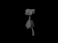
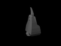
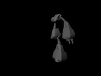
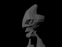
So, this is my last modeling assessment: we were asked to design a monster. We could based our design on existing creatures but had to twist them to make them our own. I really wanted to try something different for this assessment, so i changed a bit(just a bit) the style to come up with something a bit more realistic(even though the end result still look a lot cartoony from my point of view). The first idea i had in mind was some kind of werewolf with wings and then as i was sketching i came up with a fat dog with skinny arms and wings:

(which came out rotated for some reasons oO)

I came up with the character model sheet afterwards, not as nice as the previous ones though: the lines don't match up, i had to change the shape of the body a bit to get a better model. Also didn't get the time to align them properly in one file:


The character poses and textures were the last thing I did(even after modeling and texturing), I knew already the poses I wanted it to have it pretty much from the sketching phase:
(Could be better but good enough for their purpose)

Then came the final picture including a simple background:


First time doing it all in photoshop, I definitely like sketching on paper first better. It turned out alright, one ear is missing though.

Moving on to the 3d:

Final render(white BG because of the Alpha)

I used SSS-Shader for the skin, a couple of Area lights specially for the wings. The modeling itself wasn't too hard. I quite enjoyed modeling the face and "sculpting" the muscles. UV Mapping was easier than the other models I've done so far and came out clearer. I've still got issues with hands modeling. A simple rig to pose the model, the deformations were ok except for the legs but you can't see it too much and that's about it for 3D.

Then imported to photoshop:


You can see how much the picture has changed since the Final Render from Maya. I've used a couple of ambient occlusion layers(AO ftw!). The shadow and reflection passes didn't came out well unfortunately so I wasn't able to use them to the fullest. I added a simple background made out of a couple of random textures and done! It might be a bit too much of photoshop for the end product, but I still like it.

Overall, the model as its own defaults(mostly around the hands and where the body doesn't deform well); the head came out pretty much as I wanted, same goes for the wings. I could have come up with a better background but I wouldn't want to use a random picture from the net and I didn't have time to model a proper one(which would have been some kind of ruins I think).

That concludes my last modeling assessment for the year. We'll still be having modeling next semester but it will be part of a much bigger project. Project that I will be talking about in the next post!

Wednesday, 19 May 2010

Doctor X final render

Here it is! Couple of hours modeling, texturing, rigging and lighting for a quite good result I think:


(click to enlarge)


Still not so good with the texturing part but it's getting there. The rigging was way more easier than for the robot, just had to be careful with the coat since it's a separate object from the body. The 3d model turns out to be not as expressive as the 2d one, still ok though. Smoke done in photoshop with the custom brushes from:here

Things to consider for the next model:
-try to get a cleaner mesh, it makes it so much easier to UVmap later on...
-get some good references for the textures. I made them all from scratch with a couple of reference pictures not of the best quality.
-a bit more planning when it comes to rigging(which I had to start over a couple of times for missing details)

BTW, the occlusion pass looks so cool!


Not the best quality here, saved from tiff to jpeg so lost of the alpha channel=> weird outline around the character, also not from the final render but from a render test i did earlier.

Next time, some concept sketches for a monster!

Tuesday, 27 April 2010

Doctor X: Character Model Sheet

Hello!

Here is the character I've been working on the last few weeks. This time we had to choose between 4 possible characters: a vilain, his henchman, a hero or his sidekick. Since I've been doing quite a lot of hero I went for the bad guy: Doctor X. The plot is based in a near future, Doctor X has created a formula designed to reduce mankind to ashes. The formula might have something to do with his skin colors:


He's not really tall, the reason why he is so evil. His coat is way too big for him but it's a trick to make people believe he has an average size once on his xPod:


Some poses and textures to conclude:


Next time the 1st steps of the 3D modeling :).

Tuesday, 30 March 2010

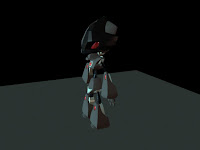
Robot Rendering: Final Stage

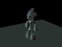
Here it is mwahahaha! The final render of my robot, after many hours spent on this project. I'm quite happy with the way it turned out. It could have been better but it's the 1st time afterall I got to use maya for modelling/rendering, and first time rigging ever(4h on it and bit of issues on the fingers and the arms but you can't tell from the pictures so it's ok :P). Again, you can click on the pictures to enlarge ;).


Before smoothing


After smoothing. The bump map on the legs and arms came out too strong so I had to turn it down and the shadow didn't look right either.


Final render. Could have been a better view and background but when I tried to change them Maya kept crashing :(... Anyway, looks good to me :D


Feel free to comment/critic :D.

Next time some characters model sheets for my next assessment ;). Cya!

Wednesday, 24 March 2010

Robot Modelisation: Walk Through

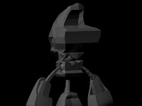
Hey! I've been working non-stop on this project lately. Here are some pictures of my model at different stages of the process, from the modelling to the lighting/scene set up and even a bit of texturing. They are low poly so it doesn't look too good :P, I won't smooth it out before the actual final render(some pictures next week hopefully). You can click on the images to see them bigger(except the 1st one for some reasons...).


Start off with a box for the hips, shape it following the character model sheet.


Same for the torso, the spine and the legs are tube extruded, the others shapes are mostly spheres.


A leg :P.


It's getting there, the arm is almost the same shape as the leg, I could have save up some time by planning this out and duplicate the leg before extruding but didn't think about it unfortunately. Good exercise though :).


The head, hardest part to model.


Details from the back, almost done now just a couple of really small pieces missing like the back of the head and the neck.


Lighting test and texturing of parts that don't need UVmapping. Mostly to see how the materials reacts with lights even though it's not smooth yet, it gives a pretty good idea of what to expect.


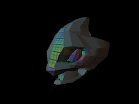
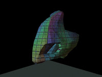
UV Mapping, beginning :(. Even though it's highly time consuming and a bit of a pain, I kinda like it. It's like a puzzle where you need to put the pieces back together :P.


The whole head mapped, not really neat though, could have done better ^^".


Import of the textures made in photoshop out of the UV map. 3 shaders: Diffuse, Bump and Specular. Bump and Diffuse were quite easy since it's a flat color with a metal texture on the top of it i'm gonna be using for it. The spec map required a bit more of thinking.


And that's it for today! I've done the texturing of most of the model by now, just got the shoes and the fingers left. Then comes the posing and then the rendering(with some HDRI , can't wait to finish it :D).

See you next week~

Tuesday, 16 March 2010

Robot Design Step 2: Poses and Textures

I'm back with more robots hehehe. Actually the same one but in different versions, looking at textures, how highlights and shadows are cast on it. About 10 hours of research for poses/sketching/tracing off/coloring. The deadline was today so I had to rush a bit to get it done in time and didn't to get as much details as I wanted to but I'm still quite satisfy with the end result:


(click it to enlarge, it's a jpeg not great quality but you can see more details)

The black one came out really nice, so far that's the one I like the most in terms of poses and colors(the colors from the character model sheet weren't too bad as well) so that's the one I'm going with. The objective is to get my 3d model as close to it as possible. The 3d model is due next week so I'll upload it up once I'm done with some shots of the WIP. Cya then!

Wednesday, 10 March 2010

Character Model Sheet: Robot

Almost a month since my last post, about time to add something new :).

I've been working on this for the last couple of weeks, it's part of one of my first assessments this semester. It consists in designing a robot and make it in 3d while trying to stay as close to the design as possible.

I tried to design a cute robot for this one but as I started to add details, the head wouldn't match with the body anymore. So after a huge amount of drawings and a lot of inspiration from this :P, I got to this point:
Lined up in Flash and trace off all nice and clean hehehe:


HYDRAULIX is the name of the fake company given to us in the assessment brief.
It's low-rez ,doesn't have any highlights or shadow and the perspective is a bit off on the front view but there is the basic shape of the model+the colors. This is more than enough to take it to the next step: 3D modelling.

I've already started modelling(using Maya this year, so far I like it better than 3ds Max) but more on that next time!

Saturday, 13 February 2010

Happy Valentine's Day!

Here's is my small contribution for this day. Hope you lovers out there know how lucky you are to be with one you love and for those of you who are single, your time will come(maybe with the help of this little swf lol, if it ever works leave a comment :D).


A couple of days worth of planning/sketching/coding, not much but I hope you like it ^^.

Thursday, 7 January 2010

Customized MSN smileys- Girl Version

Yeah! Here it is, the girl version of my customized MSN smileys. Again you might use them if you kinda look like the girl in the picture :P.

MSN Smileys for Girls


Oh my, I just realised I can upload pictures directly from the blog... Nevermind, I'll know next time.

Anyway, hope you liked it :). Next update should be some Characters Model Sheets, see you then!

Tuesday, 5 January 2010

Customized MSN smileys

Yeah! 1st "creative" post of 2010 hehehe. It's not much but I'll try to keep them coming :).

So this was done 'cause I was sick and tired of these ugly default msn smileys. It doesn't have all of them but all the ones needed for a basic msn conversation(Except for the crying one and ">.<" face which I may take care of anytime soon).


Free Image Hosting by FreeImageHosting.net
(click to enlarge)

You may use them if you wish, but there wouldn't be any point in doing so as I made them for myself lol.

I got a request from a good friend of mine for a girl version of it, it should be up before the end of this week :D.

PS: If one of these ever pop up in one of your msn talk, please give a link to my blog hehehe.

Friday, 1 January 2010

Happy New Year Everyone!

Yeah, already 2010! It's going so fast... Anyway, I hope everyone had a great time on the 31st and that all your dreams for 2010 become true :D.

I'll try to upload a couple of things before my classes start next month but since I'm still on holidays we'll see how it goes ^^.